Merging transit with on demand rides
After quickly launching the MVP of Uber Bus, our team (product, design, marketing, and engineering) headed to Cairo to talk to riders and drivers about what was and wasn’t working with our product and how it stacked up to the competition.
Challenges
1. Riders thought pickup and dropoff spots were negotiable
2. Riders preferred landmarks and points of interests over maps
3. Rider’s were confused about where bus was available
4. The main Uber app was slow and heavy for many lower end devices
5. Riders liked Bus being on demand but wanted more visibility into upcoming pickup times
6. Riders could only buy one ticket at a time
Solution
We used these findings and quantitative data to define our road map and features set for 2019. We took a phased approach for our next projects and tied them back to our team focus areas of affordability and reliability.
Phase I
Focus on moving to static routes, increasing route discovery, and building a Bus version of Uber Lite (the Uber app for emerging markets)
Phase II
Allow riders to schedule in advance & to buy tickets for 6 people at a time
Phase III
Define a 5 year north star vision and integrate an Uber Bus Tab in to core Rider app. Allow for route discovery and quick re-booking.
Company
Uber • Shared Rides 2019
Role
Product Design Lead
Responsibilities
Defining Product Vision
Defining Product Roadmap
UX Design
UI Design
Prototyping
User Testing
QA
Phase I
Point of Interest Based Booking
We transitioned our routes from dynamic to points of interest based routes with had specific hours of operation.
We then designed and launched a booking flow that allowed riders to chose their pickup and dropoff from these stops and choose from the next three pickup times.
Building a “Lite” Bus app
In parallel, we worked with the team in Bangalore to build an Uber Bus specific version of the Uber Lite app. It was made specifically with emerging markets and their Android users in mind.
The work we did to make stops static and have point of interest based pickups became super important for this mapless version of the app. We were able to launch features on both apps experiment with different iterations simultaneously.
Phase II
Micro-Scheduling & Capacity
For Phase 2, we built into the product focus view. This allowed users who wanted a to make changes to their capacity or pickup time to do so in one page and reduced the number of extra steps they’d see per request.
For pickup times, we started by showing upcoming bus times for the next hour, which helped move riders perception of the product as more reliable.
For capacity, we moved from riders only being able to request 1 seat to being able to request up to 6. This was a surface where we could inject some delight through an educational illustration/animation.
Scheduling a week in advance
We learned from our micro scheduling test that it created a sense of reliability and decreased cancelations. So for the next phase we made scheduling a mandatory step, which allowed riders to book multiple trips up to 7 days* in advance.
*Fun fact: Bus didn’t operate on Cairo’s Friday and Saturday (their weekend), so those days were skipped over in the experience.
Phase III
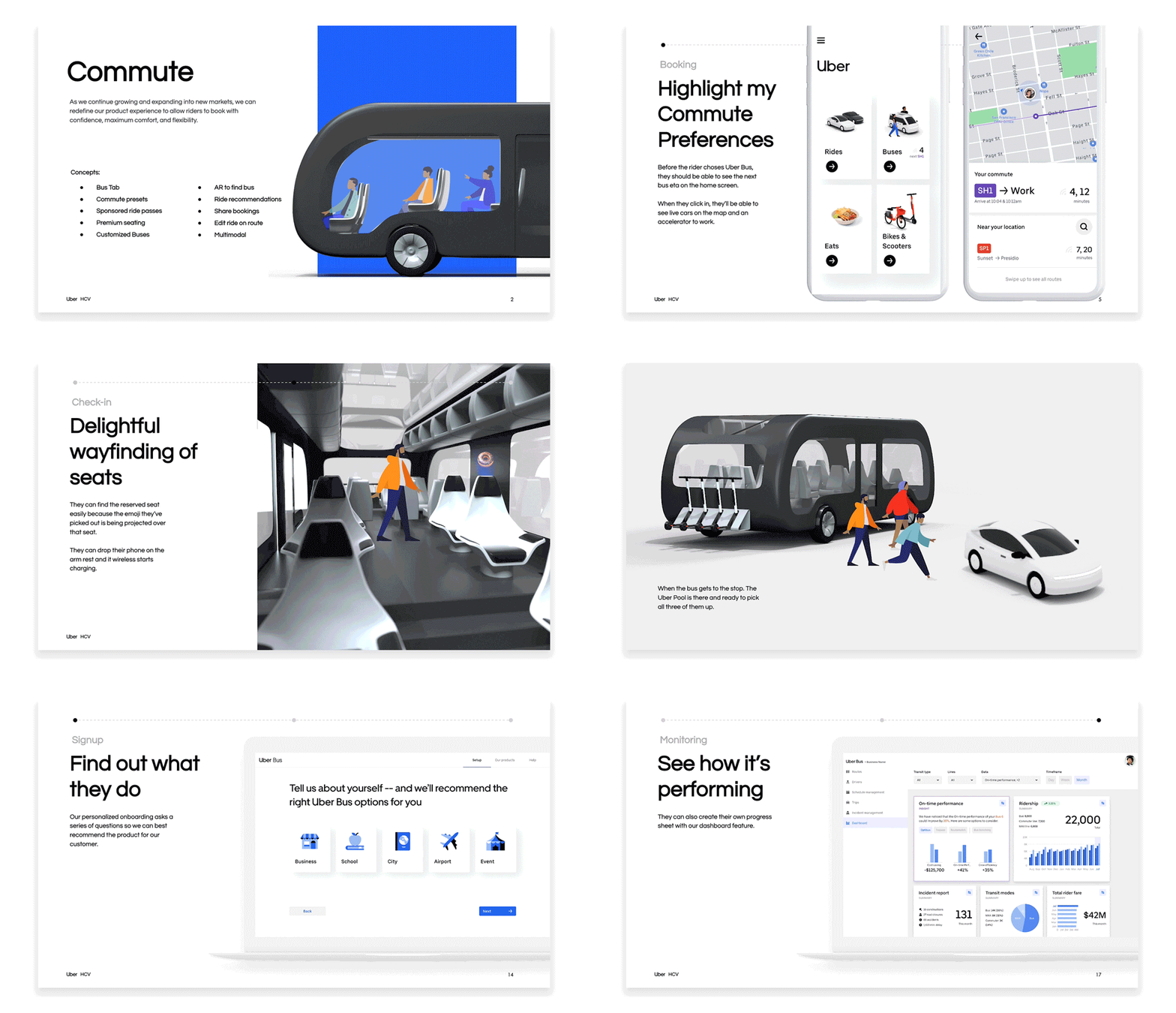
Defining the vision
After I wrapped up design work for Phase 1 and Phase 2 — and in the process gave engineering a 4 month backlog — the team took that summer as a chance to zoom out. I ran several workshops with the XFN Team to brainstorm what an ideal Uber Bus experience look like in 5 years and cover other ways we could monetize the service.
The outcome was a deck with 20 core concepts which we presented to XFN leadership, various product teams, and at design all hands.
Designing an Uber Bus Tab
After rallying stakeholders around what an Uber Bus tab could look like in the Vision work, we got to building in the fall of 2019. We tweaked the route overview page from phase 1 to highlight nearby routes and etas on the home screen. And increased conversion by elevating the routes riders took most often. Letting them rebook in a fewer taps.


